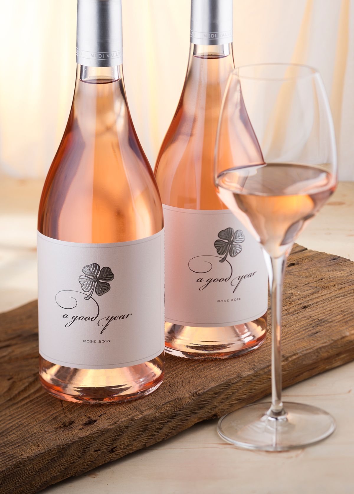


Fancy new look for our wine label with clover
This is my second try to create wine label with clover. The first one was done in 2011 and this brand new version is actually a major restyle of the original A Good Year wine label. The original release featured calligraphy, more texts and more colors. The redesigned version is significantly changed. First we decided to use absolutely different bottle – our good old friend Agape made by Saverglass. I love this bottle for many reasons and I am always happy to use it for every new project – this one was no exception. The other big change was paper. Initially I picked my favorite Velmart paper by UPM Raflatac because of the pure harmony between its texture and my artistic calligraphy. In the new version I was looking for very clean, gentle and even feminine design and these were actually the keywords that helped me pick another great paper – Jade Raster by Manter. I have a lot of labels done on this paper and I really like its delicate texture and opal reflections so I was very confident in my choice.
The third serious change was the clover – probably the most important element when we speak of a wine label with a clover. I was looking for impressive visual impact of the whole label so I decided to use 3D (sculpt) embossing for the clover. This was not just a change in technology but a radical decision that changes the whole design. Because of the embossing I redrew the clover and payed really lots of attention to every single detail. Our efforts to experiment with sculpt embossing finally payed off and we got amazing result – very visible relief and a lot of details. My goal was to focus maximum attention to the clover and make the whole label very easy to remember – if people start to say that this is ‘the wine label with the clover’, then my job is done well.
The overall look of this new label is very elegant and clean paying maximum attention to the clover at the center. I removed the old text description from the original label and left only the variety and the vintage in order to keep everything as simple as possible. I used aluminum capsules in silver for the Rose and gold for the Reds and Whites. I made the front label wider and placed on the extended part the whole info from the back label because we did the same way most of the other wine labels for the other brands of the winery.
A Good Year wine label design is done for a series that changes thru the years. There are at least 8 wines under this brand though in this post we feature only Rose and the white Sauvignon Blanc. The reds are on their way and I will probably post them here too.
Credits:
Client: Medi Valley Winery
Design: the Labelmaker
Illustration: Jordan Jelev
Paper: Constellation Jade raster by Manter
Bottle: Agape by Saverglass
Photo: Jordan Jelev


