

Telling a Thracian Legend on a Wine Label
The Legend
According to the legend, embraced by the fertile lands of the Valley of Tundzha River, there once was an affluent Thracian city called Kabile. King Spartok was the fair ruler of the city and the Great Mother Goddess Kybele watched over it and protected its people. She was the master of everything that existed, the ultimate force, bringing the city together and setting its pace, rhythm and vibration. Kybele was also worshiped by the ancient Thrace as patron of all farmers, vine-growers and wine-makers.
This is the legend that inspired Villa Yambol to start this wine range paying tribute to Mother Goddess Kybele.
My task was to capture this incredible story and use it for a memorable and meaningful wine label design reflecting the ancient legend.
The Design
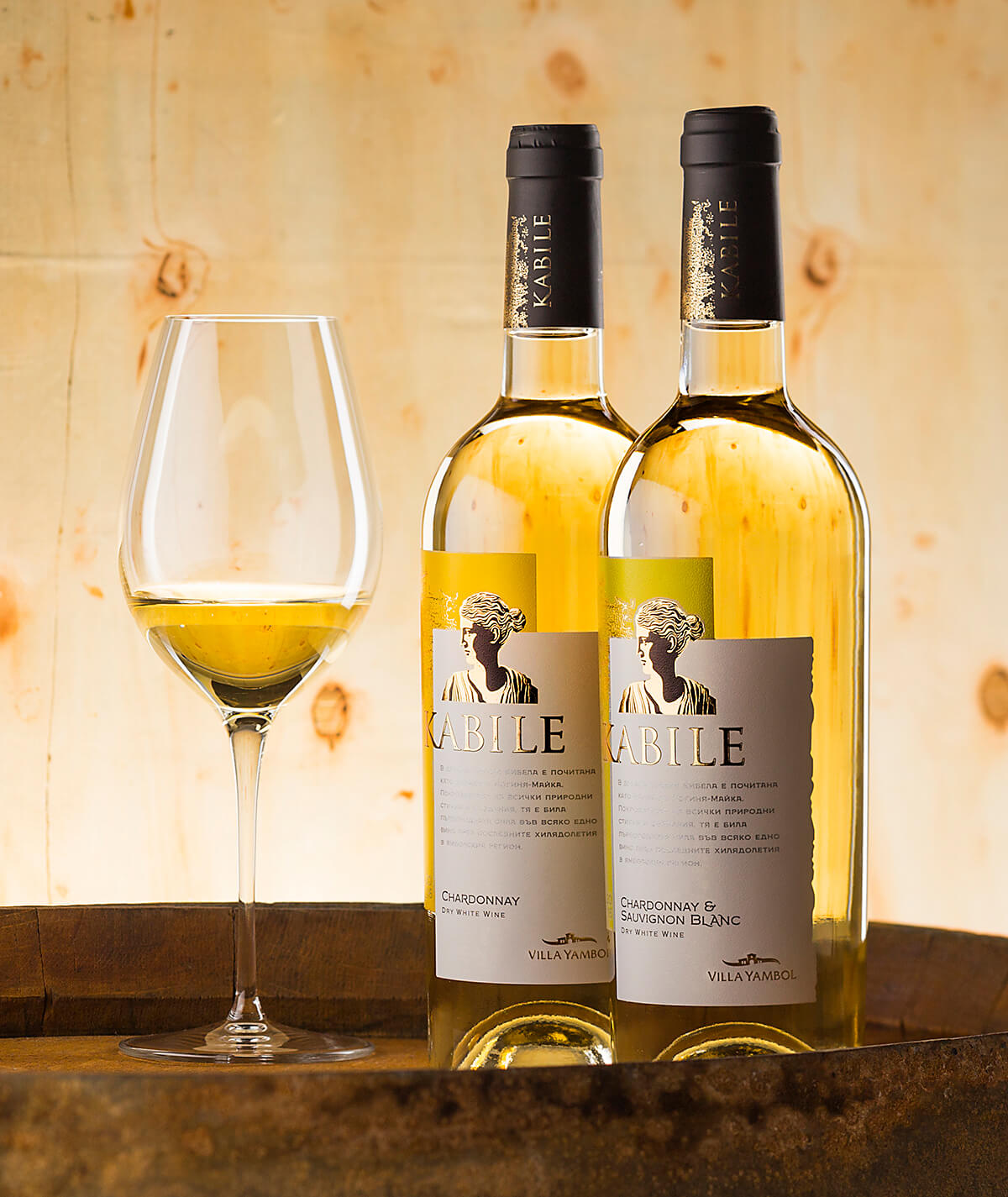
Kabile wines were something absolutely new but we had plenty of information about the whole range in the very beginning. Starting with 6 wines I was aiming at creating strong visual code for each of them. I was also looking for a design concept with potential to expand to even more wines. The other key element was the label form – I was decided to go for non-traditional die cut and make the whole packaging look even more recognizable and attractive.
Finding the right balance between color code and label form gave me the answer about the label background. I decided to use two layers or maybe two sheets – one in color and one in white placed one over another which helped me create solid yet very flexible composition for my further design work.
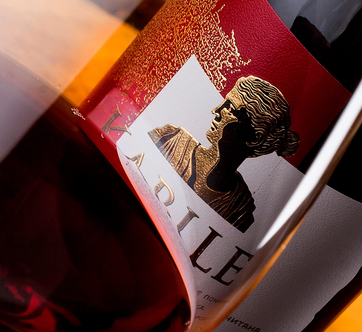
Next step was to make a very detailed illustration of Kybele Goddess keeping in mind that it should have been very precise illustration suitable for hot foil stamping and embossing. I also added a very special texture with irregular shape in gold foil to enhance the Ancient visual theme of the label and make it look authentic. We also added short text telling the Kybele legend on the front label. The whole composition ended with the elegant logo of Villa Yambol at the bottom right corner of the label.
We used tapered bottle for this wine range because I wanted to have more space for the label artwork, as it wasn’t just a wine label but a real story-telling one.
The capsule was branded with Kabile heading and I also added the same gold texture on the label.
The Result
As a result we received very consistent wine range yet showing enough diversity between the wines due to the strong visual code and solid label concept. With this design, I was trying to find a visual bridge between past and modernity because this was actually the essence of the Kybele legend we used as a source of inspiration.
Kybele’s divine vibration was vitalizing the vines and wines from Ancient times till nowadays making them a living Icon of this amazing region of culture, arts and civilization older than we could imagine.
Credits:
Client: Villa Yambol
Design: the Labelmaker
Photo: Jordan Jelev


